

Hi Crafty Friends and AECP Co-ordinators!
Now that I have successfully completed all ten classes for AECP Level 2, all that remained was to complete the Final Challenge which I just finished today! As there are two elements to this challenge I have split the challenge into two blog posts, one for the cards and one for the home decor project, to avoid having a super long post! This is the masculine cards post, please click here to visit the home decor post.
The details for the Final Challenge are as follows:
- Select ANY 3 components from the classes in Level 1 or 2 (e.g., layering 1/2, Let it shine, stencil techniques)
- Explain the 3 components that you’ve chosen for the project
- Share design tips (if any)
- Please make 4 MASCULINE cards (Themes are; birthday, Love/Thinking of You, Anniversary, and Encouragement)+ Altered Item/Upcycled Project.
- Challenge blog post: Detailed step-by-step photo tutorial and/or YouTube video
- Minimum of 10 photos (close-up and process)
- DUE DATE: Submit to the AECP gallery within one month (8/1)
- If you can come up with a new technique or new way to step up the challenge, that will be awesome! We would love to be impressed!
First Steps
I was given my mission by email on June 30th and since then I have been thinking about the final project and what I wanted to create; not only that but also which classes and which components from those classes I wanted to focus on, and how I wanted to approach masculine cards.
What is a masculine card anyway?
Well, it’s a card for a male, preferably one that the male in question can relate to in some way, and is not overly feminine. Therefore some people steer clear of florals or colours like pink that are usually considered feminine, but of course maybe your guy likes pinks, so tailor it for the recipient if necessary. Other masculine options could include using symbols from their hobbies and interests, or using images like cars, trucks, tools, hunting/fishing elements, space, rockets, nature, gaming etc. Humour is often used in masculine cards and interactive cards are also popular.
Classes and Techniques
Having all the Level 1 and 2 Classes to choose from meant that I had 20 classes and well over 100 lessons to consider. This was very difficult as I really enjoyed all the classes and there were so many to choose from, it was difficult to narrow it down to just three. After mulling it over for a couple of weeks, I decided on the following classes and techniques:
With A Twist – Die cutting with a twist – my twist is that I turned my die cuts into stamps using craft foam
Celebration Stencil Techniques – Creating stencils using dies – one of my favourite things to do is use dies to make stencils
Let It Shine – adding something metallic – even the boys deserve a little bling! I added something metallic using gold heat embossing
Themes
I chose Birthday, Love, Anniversary and Encouragement
Outline
Step 1 – Make My Stamps
Step 2 – Make My Background
Step 3 – Cutting and Stamping
Step 4 – Heat Embossing
Step 5 – Final Elements and Assembly
Step 6 – Design Tips
Step 1 – Make My Stamps
Click thumbnails to see full size images…
I had a rough idea of how I wanted the cards to look and what they should say, so I decided to use Bold Alpha and Bold Alpha Caps to make my stamps. I needed to find words that would fit across the card panels which meant choosing words of 4-5 letters maximum as these dies are quite large.
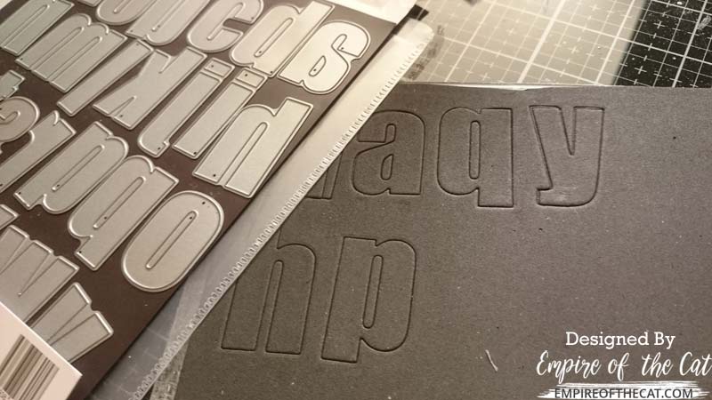
For With a Twist (die cutting with a twist) I cut my stamps from craft foam using Bold Alpha and Bold Alpha Caps dies from Altenew. These sets are two of my favourite alphabet die sets, they are really large letters and are suitable for many different styles. I would have chosen only the lower case set but the L in the lower case set is just a straight line and I didn’t want any confusion when I stamped LOVE in case it looked like IOVE. So I cut HAPPY from the lower case set and LOVE from the upper case set.
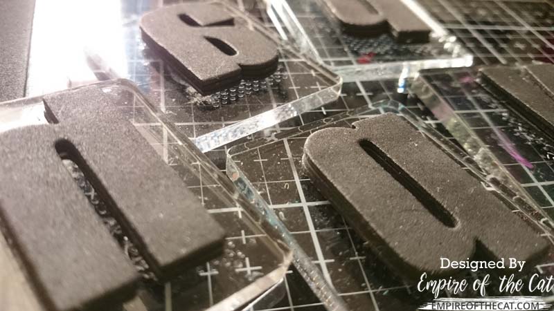 I started with one layer of foam stamps but there was not enough height with just one layer – there needs to be a reasonable distance between the stamp surface and the acrylic block so that the ink doesn’t get on the block and mess up your stamping. So I ended up cutting each letter three times and stacked and glued them on top of each other, then used temporary adhesive to stick to small acrylic blocks
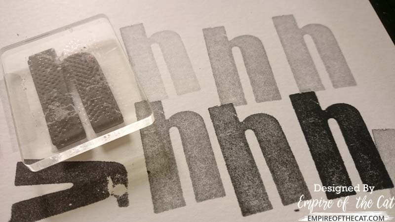 I did some sample stamping to test out my new stamps to see how well they stamp and to make sure there is enough height in the stamp so that the acrylic block is not in the way. They hold quite a lot of ink, I stamped all these Hs from one inking!
Step 2 Make My Background
Click thumbnails to see full size images…
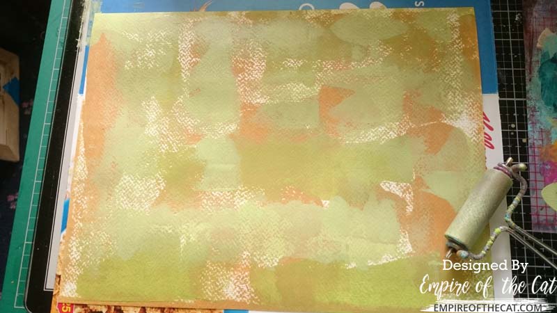
I started off with a sheet of cold press watercolour paper that measured 9.5 x 12.5 inches and is 200gsm. I used Paperartsy Fresco Chalk Paints to make my background and started off using a brayer to apply the paint. My colour scheme for these cards is greens, browns and yellows as I am going for a nature theme and quite a neutral palette.
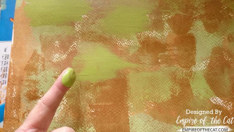
I applied layers of paint with the brayer and also rubbed some paint into the texture of the watercolour paper using my fingers, filling in some gaps left by the brayer in the rough cold press paper. Or maybe I just like finger painting LOL
I built up the background using multiple layers and colours of paint, introducing more colours as I went. These paints are all opaque acrylics and can be layered easily on top of each other without becoming muddy.
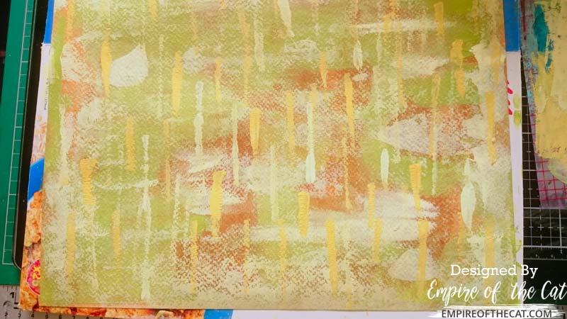
To add more interest and detail I added some stencilling using the Altenew Halftone stencil and some Snowflake Fresco paint randomly over the background. Adding the white really lifts the background colours and adds brightness.

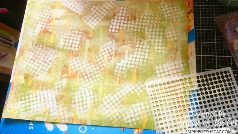
For Celebration Stenciling (create stencils from dies) and my next layer of stenciling I used Altenew’s Striped Leaf cover die to make my own stencil from a scrap piece of white cardstock. Although this is just made from cardboard I find that these stencils can last quite a long time. I have others that I made for temporary use but I have now used them at least a dozen times and they are still holding up well. They are covered in paint and can’t really be cleaned but still fully functional.
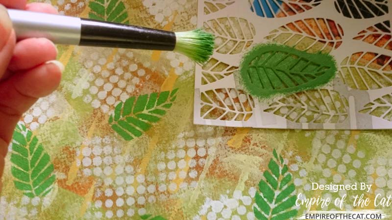
I used my homemade stencil to randomly stencil this one leaf all over the background using a nice green colour called Lawn which is supposed to be the colour of grass and so was a good choice for my nature theme. I am using an old stippling brush to add my leaf stencilling. This type of brush is designed for applying paints through stencils and especially for home decor where you might apply stencilled designs to a wall for example.
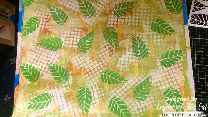
Here’s a look at the background now that it has been stencilled with green and white designs. It could be considered finished at this stage but I think I want to add something more…
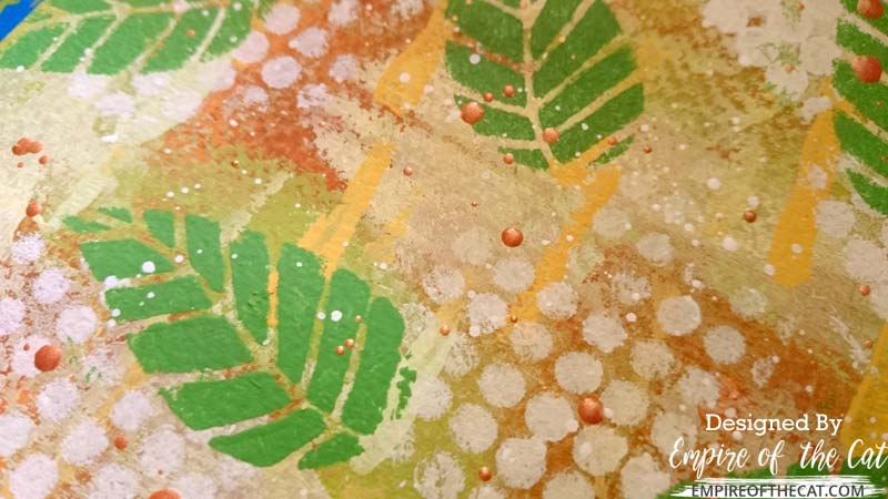
Yes I added some white spatters and then I added some copper metallic splatters which were a very similar colour to the brown paint in the background.
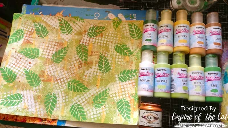
So now my background is finished and here are all 11 different paint colours I used to create it. I’m so glad this paint is quick drying or this might have taken me all day!
Step 3 – Cutting and Stamping
Click thumbnails to see full size images…
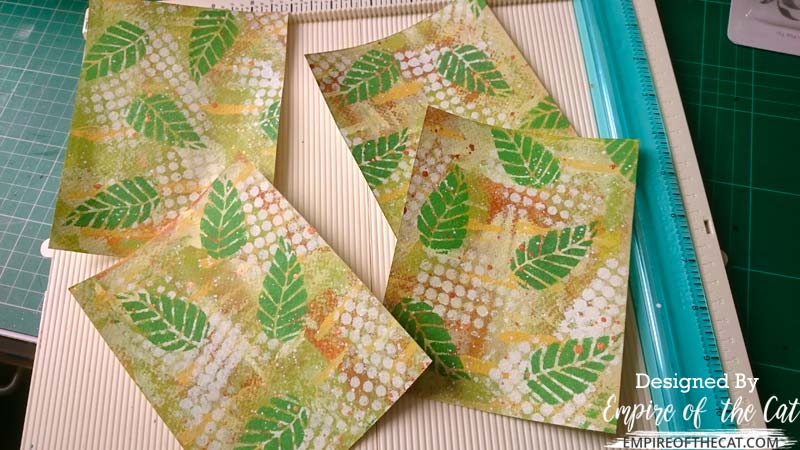 Once everything was dry, I cut my background into four identical sized card panels by cutting the 9.5 x 12.5 inch background into quarters that measured 4.75 x 6.25 inches, not a “standard” size in any way, but I don’t really make standard size cards, and I wanted to use all of the background that I made and not waste any of it.
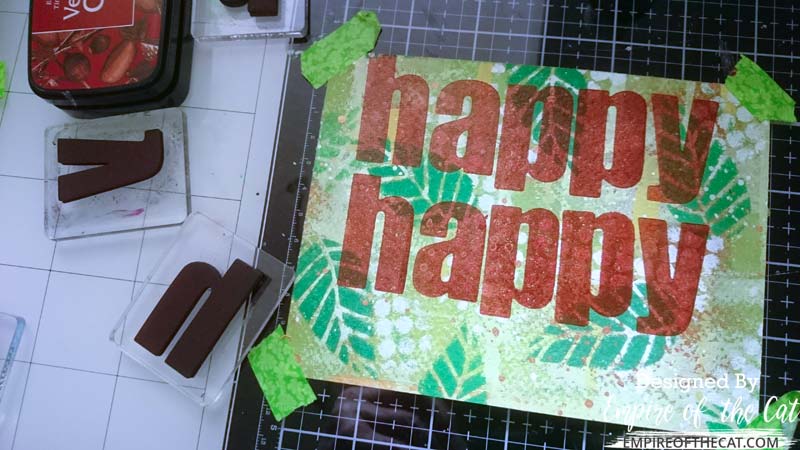 Two of my cards would use the foam stamps, so I stamped out the word happy twice using Acorn brown ink on one of the cards in landscape orientation. I lined the centre of the card up with my grid so I could get the 2 x HAPPY words in the right position, leaving a space at the bottom of the card for another element.
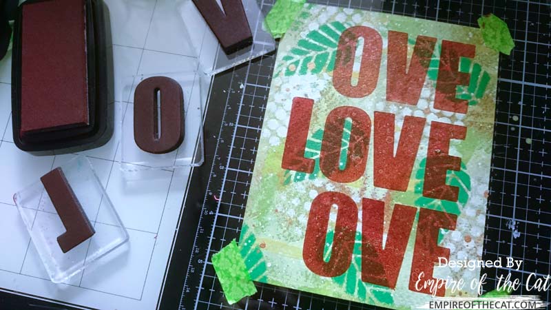 The second card uses the stamps I made from the Bold Alpha Caps dies to stamp out the word LOVE using Acorn brown ink three times down the portrait orientated card, again after using the grid to centre my card. I started with the word in the centre and then worked out from there.
Step 4 – Heat Embossing
Click thumbnails to see full size images…
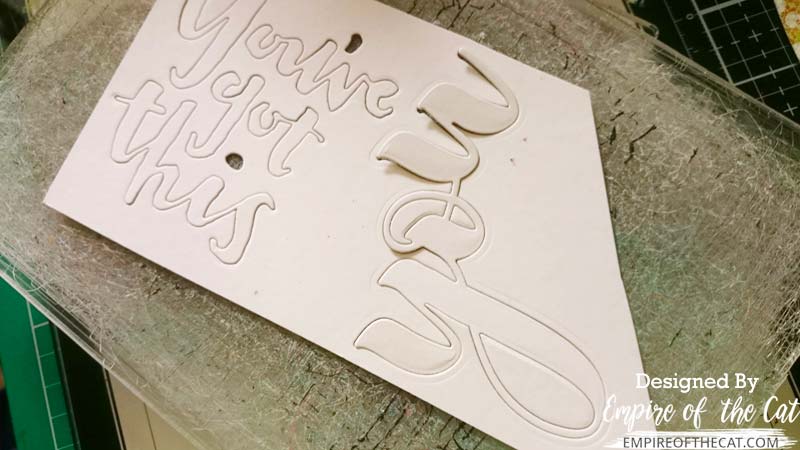 Time to start die cutting my words for heat embossing. I die cut the Mega You from Altenew for my Love card and the You’ve Got This phrase from Concord & 9th for my encouragement card. Both cut from the same scrap of white card stock.
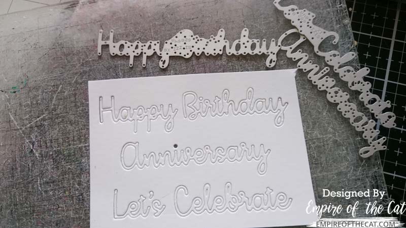 My idea for the HAPPY HAPPY birthday card required a scripty birthday word die and I was sure I had one somewhere in my stash. After a lot of searching, I eventually found this Sizzix set that had several handy script words for various occasions including birthday.
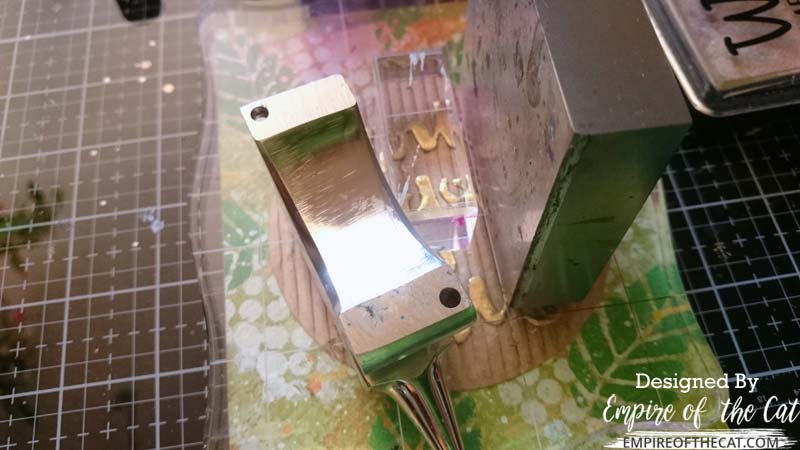
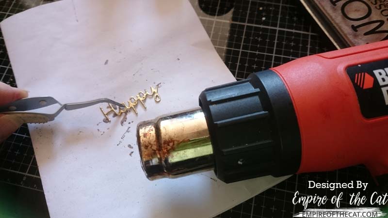 I used gold embossing powder on all my die cut words. For these small scripty words, I find it easy to heat emboss them if I put my tweezers in the closed loop of one of the script letters, eg inside the A or the P and that will stop it blowing away when you turn the heat gun on it and it will ensure even coverage as the tweezers are not blocking any of the word surface.
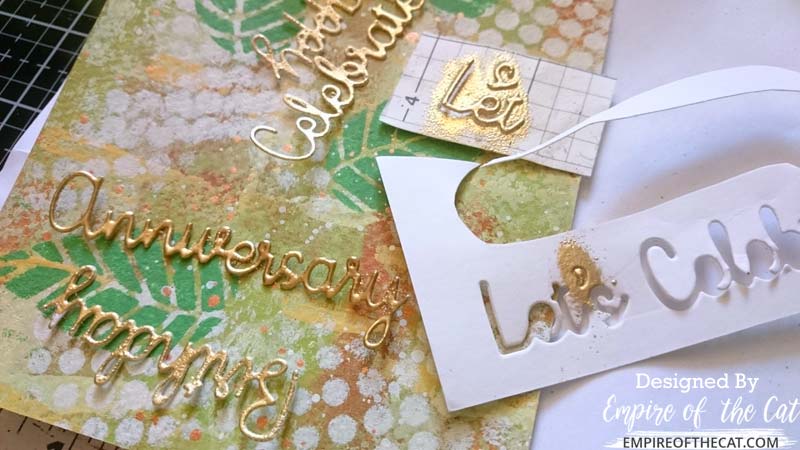 For Let It Shine (add something metallic) here are some of my little gold words ready to be added to my cards. I did a few extra words just in case I wanted to make some changes to any of the card layouts. For the really small pieces like the apostrophe, I find it easier to just leave it in place and not pop it out with the rest of the word. That way it can be heat embossed easily and less likely to get lost.
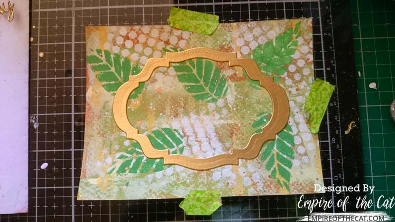
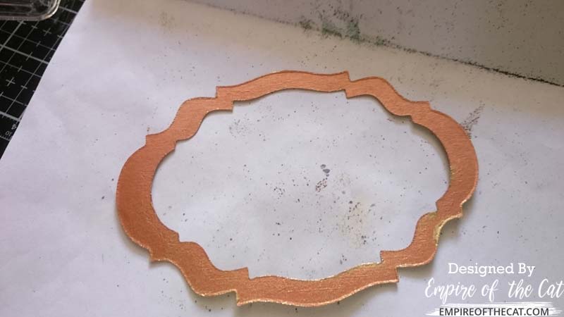 In my stash I had this previously die cut frame which was in copper metallic card stock. I decided I wanted to use the frame but didn’t want the copper colour, so it was easy to change the colour with some heat embossing!
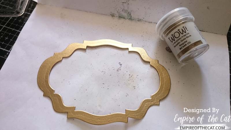 And my copper frame is now gold to match my text and can be used instead of lying around in my stash!
Step 5 – Final Elements and Assembly
Click thumbnails to see full size images…
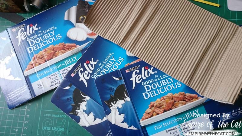 I had my backgrounds and my heat embossed sentiments and was ready to assemble my cards but I still felt that something more was needed. Another element to tie it all together and also to fit in with my nature/natural theme. I love adding recycled elements to my projects and so I decided to use some of this corrugated cardboard from some cat food boxes.
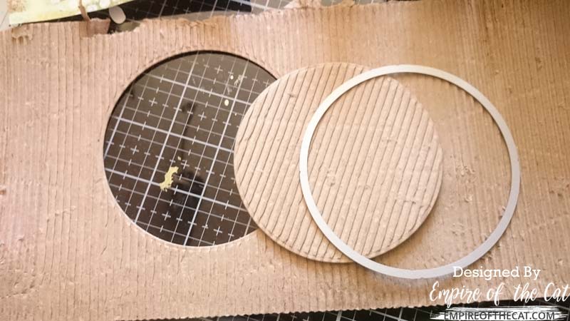 To access the lovely corrugated cardboard which is sandwiched between the outer layers of the box, use a damp cloth to wipe over the surface of one side. Don’t make it too wet, it doesn’t take much. Then just start to peel back the outer layer to reveal the corrugated cardboard inside. Only peel off the outer layer on one side for stability. If it is still damp, dry it off with a hairdryer gently so as to preserve the corrugation. Once that was done, I used a circle die to cut a circle from the corrugated card to use as a sentiment background on one of my cards.
 I then cut four rectangles of corrugated card that were 1/4 wider than my card panels, one for each card. Then I cut card bases from kraft card that were the same size as the corrugated panels.
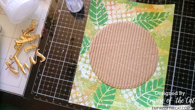 I used the corrugated circle as a background to mount the YOU’VE GOT THIS encouragement sentiment on. It’s big enough to hold the sentiment without covering up too much of the background.
 Card assembly, and due to the thickness of the corrugated card, I used some heavy objects to hold everything down while gluing. These are jewellery anvils in case you were curious. 🙂 They are small but very heavy and I use them a lot for holding things down while the glue dries underneath. I did this same weighing down process with all the cards even though they are all a little different.
 When it came to alignment, I used the grid marks on my glass mark to line everything up including this frame, and all the script words to make sure they were level and evenly spaced on the cards. Assembly is very quick, all the hard work is already done!
Step 6 – Share Design Tips
– Stick to a simple, natural colour palette with colours that live together happily in nature
– Think about ways to add texture to your cards, make them more tactile eg corrugated card, heat embossing die cut words, layers of the background
– Making backgrounds like this one can go through an ugly stage, keep going and it will all come together in the end
– If you really don’t like it, paint over it and start again!
– When making foam stamps, ensure enough clearance so you don’t get ink on the acrylic block
– Also when you are done using your foam stamps, you can always use them as elements on your projects – think eclipse cards
– When making your own stencils, use a reasonably thick card as it will last longer.
– If you are using a cover die as a stencil, you can always use the stencil as a die cut on your projects after you are done using it as a stencil, just paint over it
– If you don’t like the colour of something but really want to use it (eg my copper frame) just paint over it using acrylic paint, metallic paint or heat emboss it
– Consider using recycled elements in your project. Turn something bound for recycling or landfill, into something beautiful and/or useful. Not everything needs to be archival quality and preserved as a family heirloom forever! It’s just a card.
– When heat embossing small elements or delicate script words, either leave the die cut in place, or in the case of the words, use your tweezers or pointy stick to hold the word down using a closed loop of one of the letters eg the A, B, D, O, P, Q, R, depending on your font style. Sizzix also has a product called Sticky Grid which is just sticky enough to hold the die cuts but easy to peel them off when done.
And my four cards were completed. Click any of the images to see full size


Project Slideshow – Finished Cards
Four Masculine Cards


Four Masculine Cards
nature themed, with recycled elements and a little bling!
Final Thoughts
I loved this challenge and my resulting cards! My masculine cards are similar in that they use the same background, corrugated card, colours, and all have gold heat embossing, but they also have tweaks to make them a little different from each other. I spent a day making the cards and then half a day editing the photos and writing the blog post.
These masculine cards would appeal to a lot of guys, the nature elements and muted natural colours, and just enough interesting elements to peak their interest and make them wonder how they were made ie what is this corrugated cardboard, how did you make these gold words etc. I hope you like my manly cards, let me know in the comments below!

>>>This is Part 1 Card Project, please click to visit Part 2 Home Decor Project<<<
PROJECT RECIPE:
Altenew – Bold Alpha and Bold Alpha Caps dies, Halftone stencil, Striped Leaf cover die, Mega You die
Sizzix – Every Occasion words dies
Concord & 9th – You’ve Got This die
Wow – Embossing ink, Gold Rush embossing powder
Versafine – Clair ink – Acorn
Gina K – Cardstock – Kraft
Tonic – Tim Holtz stamp platform, Nuvo Deluxe Adhesive
From stash: cat food boxes, cardstock scraps, previously die cut frame in copper, craft foam to make stamps, temporary adhesive, small acrylic blocks
FYI – all my Class posts for Level 2:
.Beyond Basic Backgrounds
.In the Mood for Color
.With A Twist
.Creative Watercolor Media
.Polychromatic
.Beautiful Details
.Color Your Day
.Impressive Heat Embossing
.Magical Marker Techniques
.Masking Unleashed


I like the mixed media, atrsy “Elle” look of these cards! They are SO YOU! They look terrific. A very well-written post too!
Thank you for entering your work to the AECP assignment gallery.