

Today I am sharing an art journal page I made for a couple of challenges. Actually it started off with the intention of fitting in with the colour scheme of one challenge and no real direction at all beyond that, and as I worked on it, it became apparent that it would also fit with one or two other challenges. It’s funny how these things take on a mind of their own.
OK so here’s my page. As it evolved I kept thinking that this sad-looking woman was in need of some chocolate – maybe a lot of chocolate lol. Chocolonely for those who don’t know, is a Dutch chocolate company (Tony’s Chocolonely) and it used to be the case that they were only available in Holland but now you can get them in a few places here as they started exporting last year. NOMO is a vegan chocolate brand and that stands for No More Missing Out. This packaging came from an Easter egg that a friend sent to me for my birthday this year. It was yum! Sometimes vegan chocolate has a weird aftertaste but this didn’t and it was Salted Caramel flavour and I was in chocolate heaven. Tony’s btw is not a vegan brand but they have a LOT of flavours and some of them are vegan.
So yeah, this girl is chocolonely because she’s missing her chocolate 🙂 and I’m calling her Chocolonely Chick as it reminds me of the Lonely Chick song, though she uses a different word NSF radio lol.

Click on the thumbnails for a closer look…
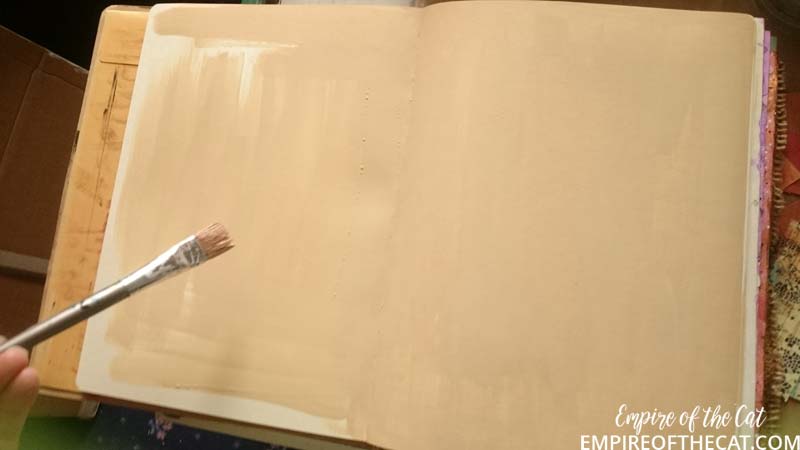
I’m using a Dylusions journal this time and the manilla pages I feel, are too light to be considered “kraft” so I painted them.
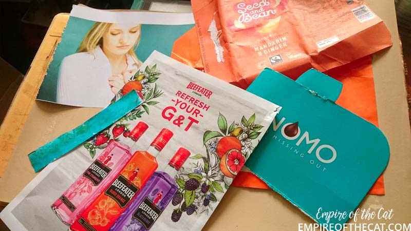
Here’s some of the collage materials I pulled together, including chocolate wrappers, magazine pages, some of my gelli prints.

Starting to piece everything together adding extra bits and pieces lying on my desk
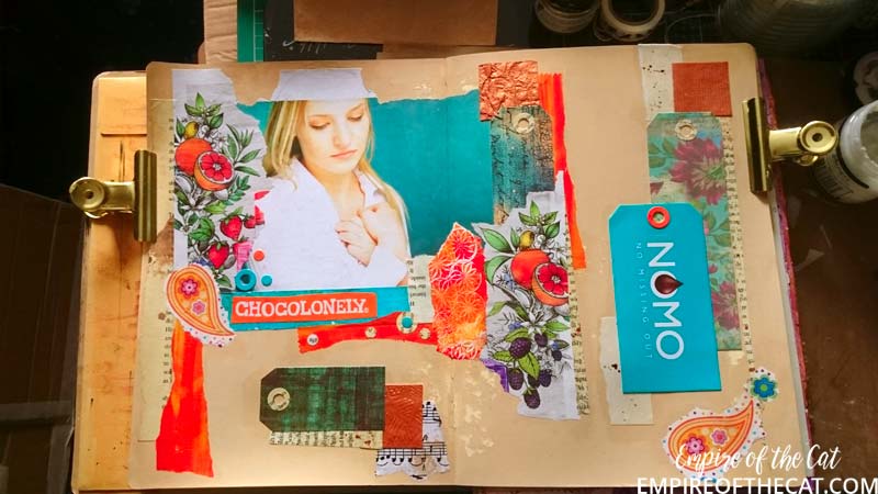
Starting to glue everything in place and making the tags from the paper scraps and NOMO Easter egg box

Here’s a closer look at some of the collage pieces and I added to the “Gin” florals
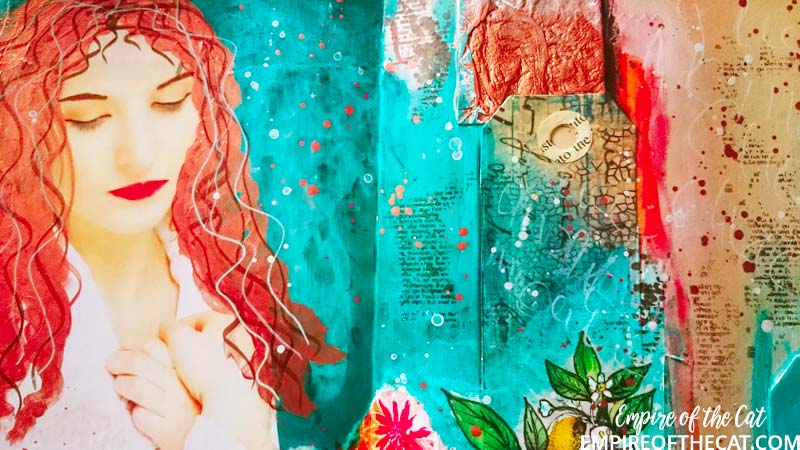
Poor woman, she probably had no idea when she modelled for this magazine that she would end up in someone’s art journal sporting metallic copper hair
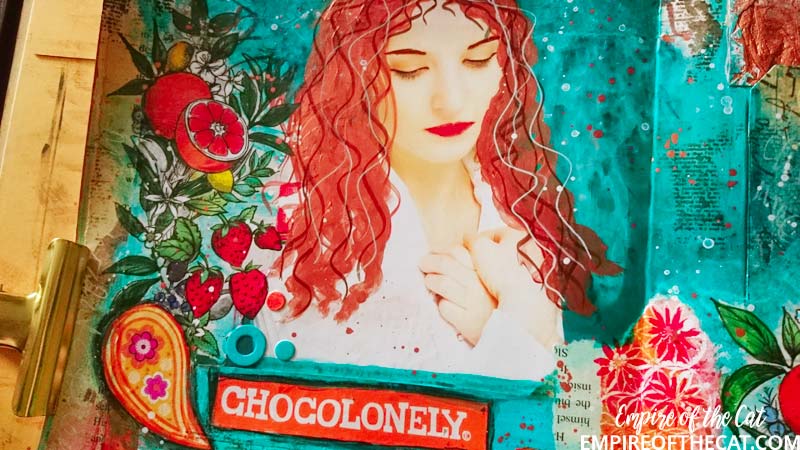 I added extra strawberries and leaves on this side and outlined the Chocolonely in black Stablio pencil
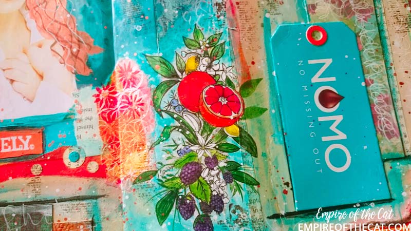 Another close up, this time of the NOMO tag and the extra leaves and fruits I added to this “Gin” floral
And here’s the finished spread. Despite how much I dislike orange, I actually like how it turned out in the end, the colours go well together, just not in my wardrobe lol. Let me know in the comments what you think. As always, thanks for reading!

CHALLENGES
OK here are the challenges I am entering:-
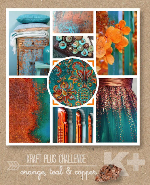
First up, Kraft+ Challenge – August Challenge – use teal, orange and copper
As the page progressed I realised that this page would also fit in two other challenges that required tags. I made my own tags (four of them) from paper and an Easter egg box.
A Vintage Journey – Tag You’re It
Art Journal Journey – Pockets and Tags
I do have another page planned for both these challenges which hopefully I will finish tomorrow but when I realised this one would also fit, I decided to enter it as well.
PROJECT RECIPE:
My art journal
Collage materials – chocolate wrappers, easter egg box, gelli prints, book pages, gift wrap, handmade papers
Acrylic paint and ink
Pitt pens, Stabilo All, Posca paint pens,
Matte Gel Medium
From stash: anything and everything else!


Love your ‘Chocolonely Chick journo spread , Elle and the story behind its inspiration. Your use of colour and your collaging is fabulous – even more so when you get up close and are able to appreciate it more along with all the finer detail.
Thanks for joining us at A Vintage Journey
x
P.S Loving your blog’s makeover – looks super professional .
A wonderful. colourful journal page and a super take on the Art Journal Journey theme, thank you for linking with us there.,
Yvonne/Meggymay
Sometimes we just HAVE to sacrifice for the good of art. Like eating that chocolate in order to create this incredible spread. I actually like these two colors together. I think they compliment each other. Like you, they look good on paper, but I wouldn’t want them in my wardrobe (grin). Thank you SO much for sharing these with us at Art Journal Journey. I keep having trouble with my internet, so that’s why it took me so long to get here.
A wonderful creative diary page, I like the colors so much.
Greetings Elke
It’s a beautiful page Elle, and the colours are stunning!
Thank you so much for joining in with the challenge.
I love your blog, and I’m following you now 🙂
Hope you have a great weekend.
Alison x
Gorgeous page Elle. Those colors are fantastic and eye catching. And I earned about some Dutch candy that makes a fantastic tag. Thanks so much for joining us at AJJ. Its so fun to see how people represent a challenge. Hugs-Erika