Hello everyone,
Welcome to Day 36 of ICAD (that’s index-card-a-day btw) and we are now well over the halfway mark! Since I have been working in batches of nine cards, I have the fourth batch of ICADs to share today. If you were interested in more ICADS, the Day 1-9 post is here, the Day 10-18 post is here and the Day 19-27 post is here, and there are a few other individual posts scattered along the way, just search for ICAD and you’ll find them. 🙂
As this also falls on a Tuesday I am sharing this with the tea gang and Elizabeth & Bleubeard. My beverage du jour is this one…
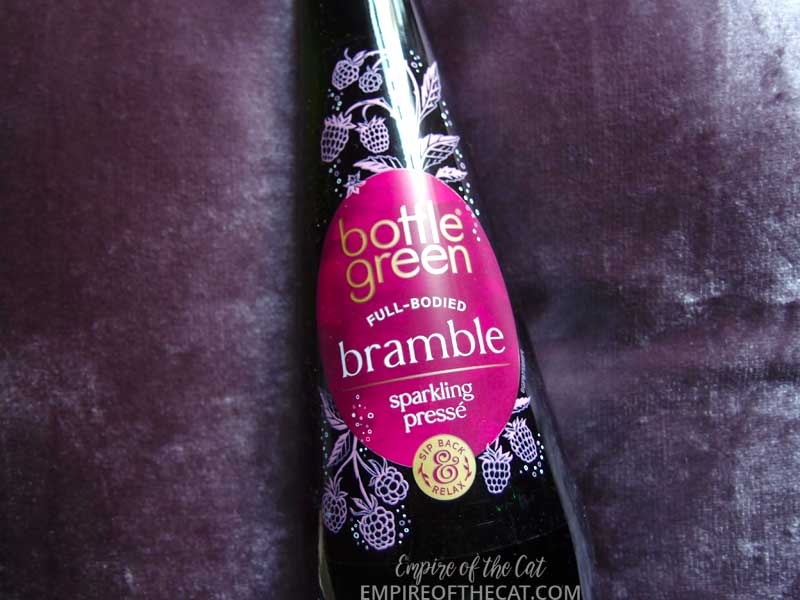
Someone is going to tell me it’s been out for ages but I saw it for the first time so I think it’s new. Normally they have apple, elderflower and I think raspberry flavours but now there is a bramble flavour. I really love the colour on this label and all the little brambles decorating it, it looks so delicious and guess what, it is! I used to go bramble picking to make jam, well to make jelly because you can’t really use it for jam, there are too many bits, so it needs to be strained, and so it ends up as a jelly with no fruit pieces in it. They grow all over the hedgerows here, just wild, and also unfortunately a few of them have taken root in awkward places in the garden and they are hard to get rid of and the thorns are quite bad. But maybe I need to be making some of this delicious sparkling drink with them instead! Here come the ICADs…
ICADS Days 28-36
If this is the first of my ICAD 2021 posts you are reading, my concept for the series is to focus on watercolour pigments and colours. Each of the 61 cards will feature a different colour. Some will be pure, single pigment colours, and others will be mixed convenience colours. So far I have been working in loose rainbow order but that will soon change! The other criteria I have set for my ICADs, is to use any leftover bits and pieces, recycled ephemera, old die cuts, collage fodder, saved tissue paper etc and not use or buy anything new except the index cards themselves. So you will see teabags, cardboard from cat food boxes, leftover diecuts, gift wrap, tissue paper, postage stamps, thread, yarn, found poetry from old books, gel print leftovers and so on.
For this batch I am using some strips of watercolour paper left over from making all the ATCs for the 100 Day Project earlier this year. I was wondering what I could do with them and then it hit me. One of my favourite ATCs from that project was the one I made for Jane Eyre, you can see the drawing here at the top of this image and see the finished ATC and journal page here.

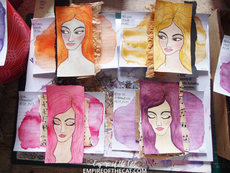
So I used the idea of my Jane ATC to draw more ATC girls on the leftover strips of paper. Although all these girls are based on the first one, it appears I am incapable of drawing the same face over and over haha. They have all turned out a little differently and have their own personalities…
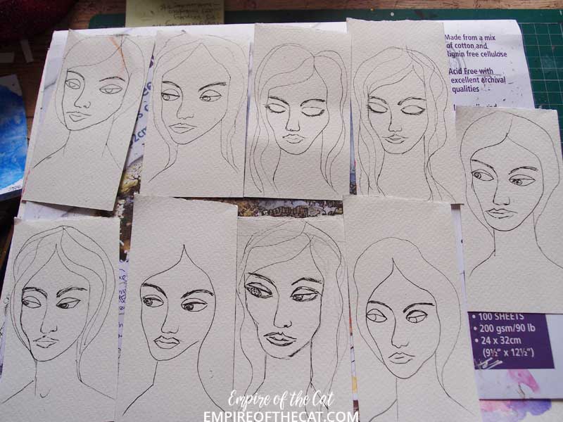
So I decided to capitalise on the differences instead of repeating the same girl over and over and gave them all different skin tones.
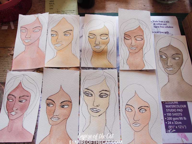
And then different hair colours, to match their ICAD bases.

First I decided which girl was going to be on each ICAD, then I painted their hair using the same paint used on each ICAD and left them to dry.
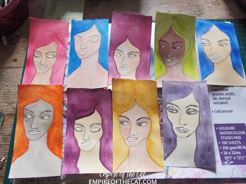
I added more details to their faces and worked out what else needed to be added to each ICAD. Things they have in common: they all have the same eye colour, lip colour, blush colour, eyebrow colour and same gold highlights in their hair. I wanted to have some things to tie them together given their differences.
Then I left them overnight while I got on with some other things, and the next day got back to them to assemble and find the words I wanted to use on each one. I made a few changes to some of the ephemera, and the words really found themselves lol.

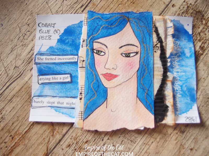
Day 28 – Cobalt Blue (2) – PB28 – I just noticed that day 28 has a pigment number containing 28, that was a total fluke! This is another handy single pigment colour, and a good cool mixing blue. Cobalt oxide pigment is one of the more expensive pigments and has been in used since early 1800s. It is extremely lightfast and a moderately intense blue. It does unfortunately have quite a high drying shift in watercolour, making it dry much lighter, so add more layers, or buy it in acrylic form where it will have no drying shift.
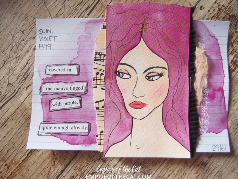
Day 29 – Quinacridone Violet – PV19 – one of my favourites, and a very useful single pigment colour that can range in colour from brand to brand. It is often marketed as two distinct colours, a darker value, lower chroma, more lightfast version (this one) and a lighter value, higher chroma, less lightfast version (see below).
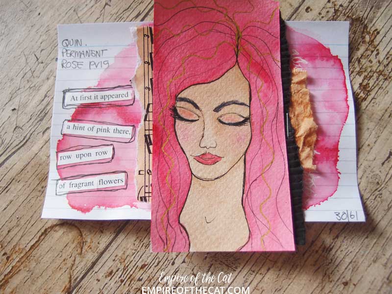
Day 30 – Quinacridone Permanent Rose PV19 – as you might have noticed, this colour uses the same pigment, PV19, as the one above but results in a totally different colour. This is the lighter value, higher chroma version of the same pigment, which makes great rose pinks, that may or may not be less lightfast.
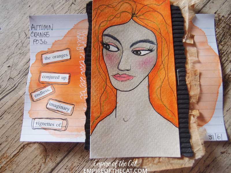
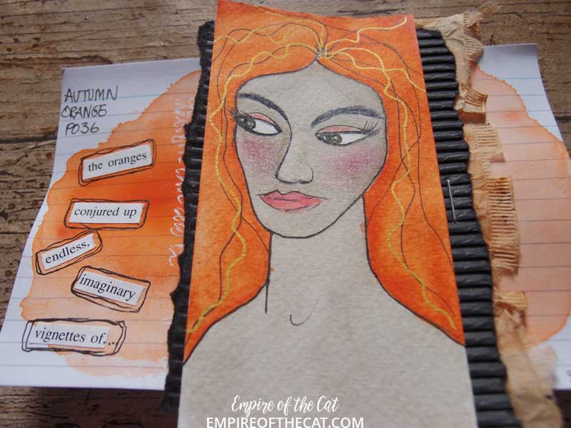
Day 31 – Autumn Orange – PO36 – in this brand (Mijello) it has the name Autumn Orange. I find that they name some of their paints oddly, for a lot of other brands this would be Permanent Vermillion and is a very intense red orange. It may look a little less intense in this photo, and also in the watercolour version of the paint there is a slight drying shift so it does dry lighter. I have noticed this far in my ICADs how much I am liking the oranges, and that was not expected!
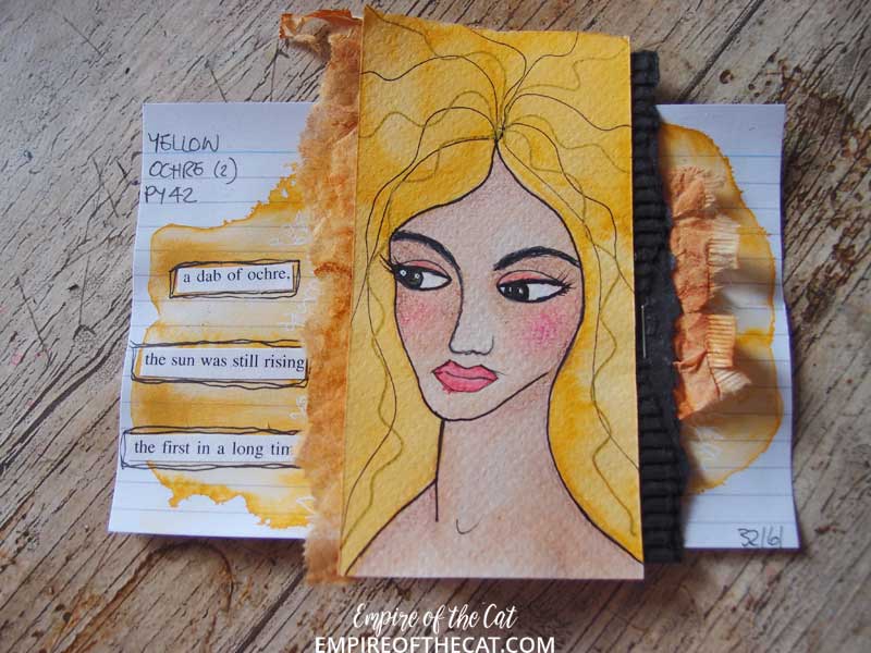
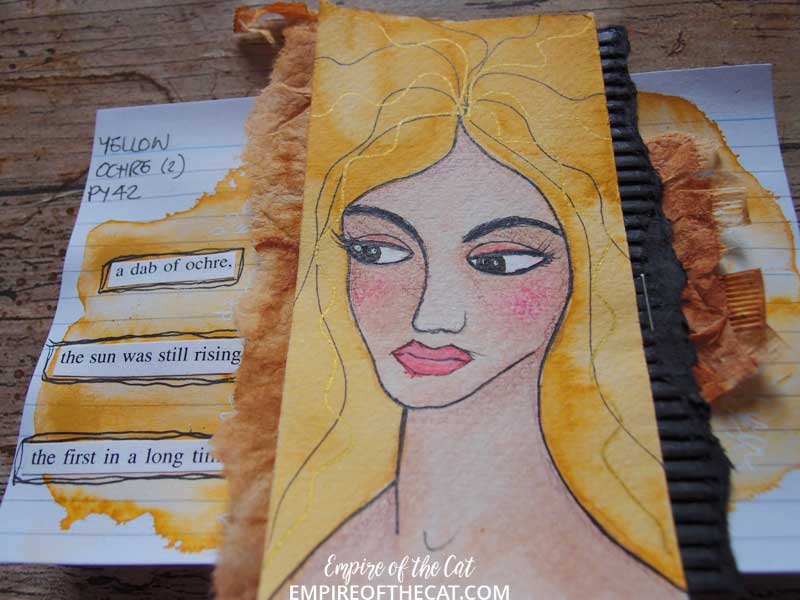
Day 32 – Yellow Ochre (2) – PY42 – note that this is Yellow Ochre number 2 from this brand (Mijello) and they do have a Yellow Ochre number 1 which is not a single pigment. The same applies to some of their other colours (see Cobalt Blue above). Mijello is a Korean paint brand and I read somewhere that in Asia, people don’t like to mix their colours so much and prefer to use premixed convenient colours. This may or may not be true, but Mijello do have a lot of premixed convenience colours which would normally be single pigment colours. They are usually much cheaper and are absolutely fine to use for painting, but if you are mixing colours, you might not get the result you expect since you would be mixing multiple pigments together instead of just two or three.
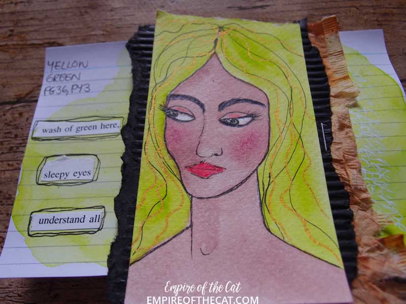
Day 33 – Yellow Green – PG36, PY3 – OK so PG36 is commonly known as phthalo green (YS), and PY3 is arylide yellow. In Daniel Smith paint the resulting colour is called Phthalo Yellow Green but Mijello are just calling it Yellow Green. It is an extremely bright lime green but the camera is not picking up the gorgeousness of this colour! As it is a mix of two pigments, it can easily be made from the two colours above but I already had it as it came as part of a set, so I don’t need to make any myself just yet but when it runs out, I know I can.
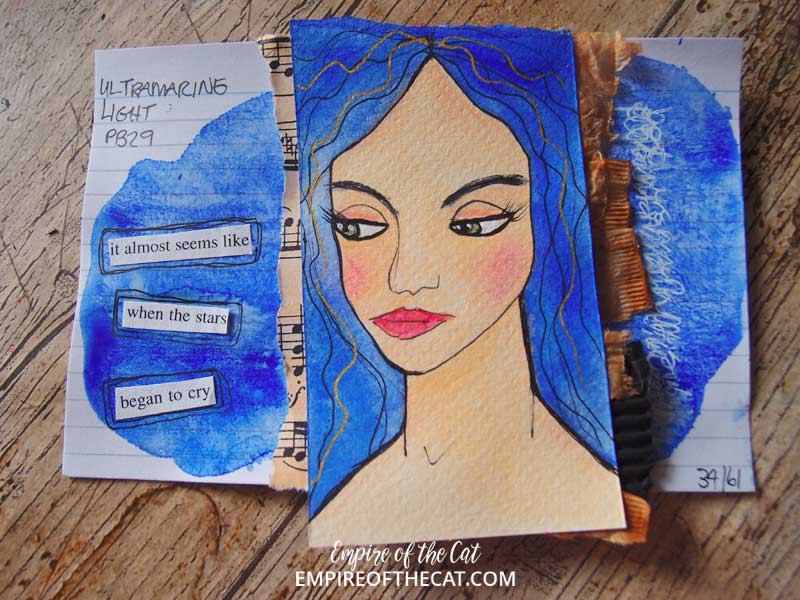
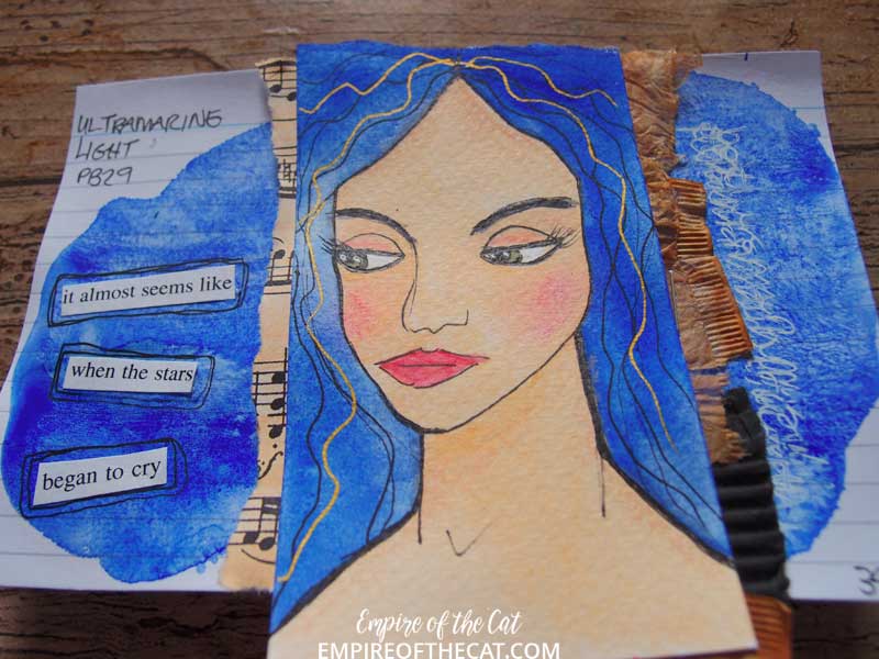
Day 34 – Ultramarine Light – PB29 – this single pigment colour is also known as Ultramarine deep, French Ultramarine, Ultramarine GS, permanent blue and so on and it is an intense blue violet. Mijello call theirs Ultramarine Light, and they do have an Ultramarine Deep that is a convenience colour. Thanks to modern chemisty, this colour of blue is included in even the cheapest student grade palettes and is the modern colour match for lapis lazuli, a most sought after pigment made from the stone, it was worth multiple times its weight in gold to artists during medieval times. I have three different versions of this colour, this Mijello one, a Sennelier one and a Daniel Smith one. In the sample below you can see a slight granulation but the Daniel Smith one has a much larger granulation effect which I love but didn’t want it on this ICAD. PB29 is also a great colour mixer and can be used with Burnt Sienna to make a range of beautiful greys and used with magentas to make beautiful violets. Try mixing it with Quin Magenta (PV122) or Quin Rose (PV19) – my Day 30 colour, and see what amazingly beautiful violets can be made. One of these colours I have actually featured in my Day 36 ICAD below!
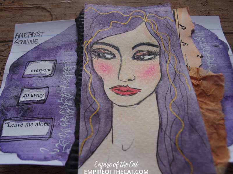
Day 35 – Amethyst Genuine – n/a – This is one of Daniel Smith’s Primatek colours, which are the “made from minerals” paint range, this one being made from genuine ground up Amethyst. I chose this colour because I love it but there is little information available regarding how much Amethyst is actually in these paints or just how they are made, it’s all proprietary information ie secret! The tinting strength is often low, meaning that you will use more paint and this paint is expensive compared to other paint in different series. It also seems to lift very easily from the paper so it is less useful if painting in layers. Just how much actual Amethyst is in the paint and how many additives are in there to make it work as paint? Unknown. I will say though, that you can see some tiny specks of gold through the paint and there is some sediment presumably from the Amethyst mineral, but how much is not made public. Some of these paints are very pricey, and for years I have been tempted by another paint in this range, Sleeping Beauty Turquoise, one of the pricey ones at approx £26 for just 7ml of paint, or occasionally up to 20% cheaper in a sale. I love turquoise, and the idea that this paint is mined from the Sleeping Beauty Turquoise mine in California just conjures up so many fairytale romance ideas but I cannot justify paying that much money for a tiny tube of paint and so I continue to resist. Another reason is that having tested a sample of this Turquoise, I found it a bit disappointing, compared to the vibrant colours of other Turquoise paints, so I console myself with the fact that I would probably be massively disappointed and be full of buyer’s remorse if I did waste my money on it.
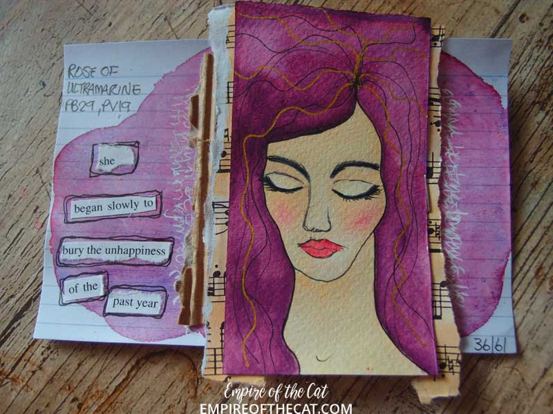
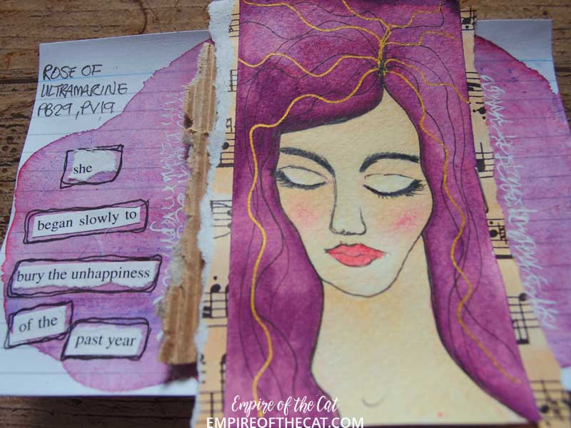
Day 36 – Rose of Ultramarine – PB29, PV19 – really, they had me at the name alone before I even tested this colour a few years ago lol. This one is of course from Daniel Smith, and is a combination of two of his other colours, Ultramarine PB29 and Quin. Rose PV19, (both colours feature above) so it can be mixed if you feel like doing it yourself, just buy those two in tubes and let the experimentation begin! I do have a tube of this premixed convenience colour though and this is what I used to paint this ICAD. Because it uses Ultramarine, there is some granulation and separation of colours as the Ultramarine separates from the violet. You can see this effect a little bit on the ICAD where the blue has separated out in various places. It is not so obvious on the watercolour paper where it has been used as the hair colour as the paint has soaked into the paper instead of sitting on the top of the gessoed ICAD.
This batch all include music paper, black corrugated card, tea bag, found poetry and journaling in white pen. They are all stapled onto the ICAD on the right side so they can be opened like turning a page in a book, and I can see the full colour underneath and also journal in the space if I want, which you can see in part, look for the white pen scribbles, a little bit asemic, a little bit real words.

Let me know what you think in the comments. Now on to the next batch!
As always, thanks for reading!
Ingredients
index cards, watercolour paint, collage, book paper, music paper, cat food box, teabags, found poetry, black corrugated card scraps, black pen, white pen, gold pen, Neocolour II, Pitt pens, Polychromos pencils, gesso, glue, staples
Challenges
ICAD – Day 28-36
T Stands For Tuesday – T stands for delicious new discovery – Bramble Bottle Green presse!
You might also like . . .









Really loving these cards with the watercolor faces. Lovely! And that bottle is so pretty–makes me want to have a drink of it. 🙂
They are all wonderful!! I love the colors!!!!
Fabulous set!
Hi Elle, lovely to meet you , thanks for your visit, I’m late getting round this week, I love the sounds of the bramble presse, I buy the elderflower presse, they do sell a sparkling one now but I haven’t tried. Yet but I will look in our Spanish Tesco store.
I love your artwork with all the different colours and ladies, gorgeous butterflies and all beautiful colours,
have a great weekend
jan
No, I’ve not seen that flavour. Does it taste like black berries? I used to get the elderflower from Bottle Green. And the spiced berry cordial in winter.
Wow, your ICADS with the Janes and the colours are beautiful!
I just realized your drink is not a squash but a ready made drink. All the same, it looks very inviting.
Happy T-Day,
Hugs,
Lisca
I have never seen that drink so it is new to me too. LOL I love your cards especially the orange and yellow ones. Have a nice evening.
Wow, such beautiful faces! Love how you added them to the papers and quote – amazing ?. The yellow and pink are my favourite, just gorgeous! I’d love to try that bramble drink too – so yummy! Happy T Day! Hugs, Jo x
I’ve never seen that drink before, but it sounds tasty. I like your varied faces. Happy T Tuesday!
Bramble sounds so yummy. I love that word. We don’t use it here in the states except sometimes when describing a bunch of thorny wild overgrowth. It sounds quick yummy of a drink though. And I am loving all those ladies on your ICADS. Hope you are having a great T day and month of JUly also Elle. Hugs-Erika
Oh wow- your portraits are so beautiful!!! And I love your unique theme for the cards as well. Your beverage sounds nice especially for this time of year. Enjoy, and happy T day!