

Hello everyone,
Welcome to Day 45 of ICAD (that’s index-card-a-day btw) and we are now definitely in the home stretch! Since I have been working in batches of nine cards, I have the fifth batch of ICADs to share today. If you were interested in more ICADS, here are the posts so far:
Day 1-9 post is here,
Day 10-18 post is here
Day 19-27 post is here
Day 28-36 post is here
and there are a few other individual posts scattered along the way, just search for ICAD and you’ll find them. 🙂
Here come the ICADs…
ICADS Days 37-45
If this is the first of my ICAD 2021 posts you are reading, my concept for the series is to focus on watercolour pigments and colours. Each of the 61 cards will feature a different colour. Some will be pure, single pigment colours, and others will be mixed convenience colours. So far I have been working in loose rainbow order but that will soon change! The other criteria I have set for my ICADs, is to use any leftover bits and pieces, recycled ephemera, old die cuts, collage fodder, saved tissue paper etc and not use or buy anything new except the index cards themselves. So you will see teabags, cardboard from cat food boxes, leftover diecuts, gift wrap, tissue paper, postage stamps, thread, yarn, found poetry from old books, gel print leftovers and so on.
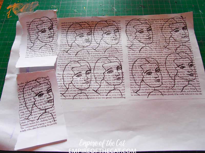
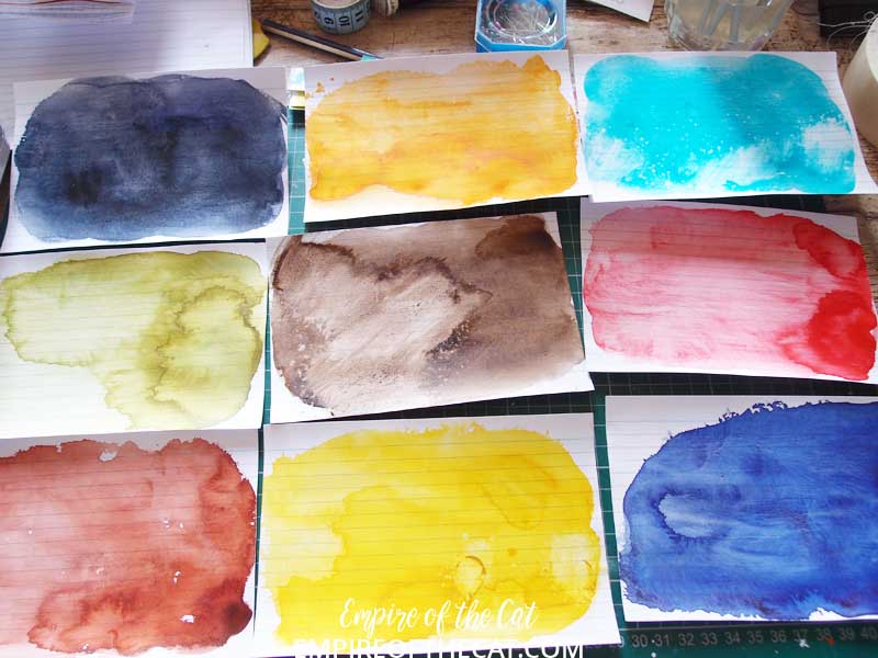
For this batch I am using some pages from Jane Eyre that I printed out a few months ago for another project. These are the leftover bits I didn’t need but nothing goes to waste here so I knew they would come in handy for something. After my last batch of ICADs where I used the same drawing (which also came from the Jane Eyre project) I thought I would again use faces for this batch, and again I used the same face over and over but again, I am not so good at repeating faces very accurately so there are slight differences that probably no one sees but me! Then I chose my next nine paint colours and painted them on to the index cards.
 Then I started to layout the composition of the cards, a lot of what is on here didn’t make it to the final cards but I was just trying things out to see which one I preferred. My favourite was the layout in the bottom right of the photo which uses this kind of waffle cardboard packaging that arrived in a recent order, so I ended up using a variation on that for this batch.

Here’s a production photo lol. Various cards in various stages of completion and being placed under something heavy till the glue dried.
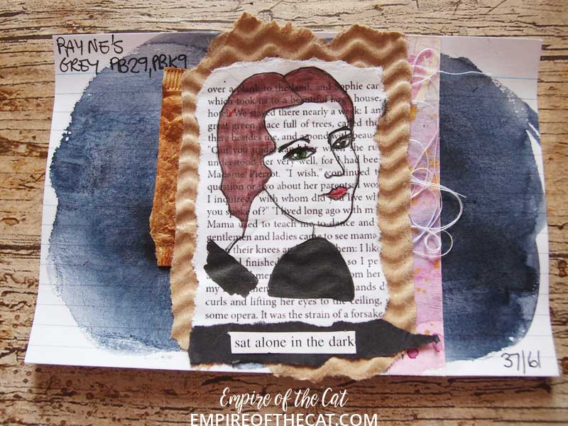
Day 37 – Payne’s Grey – PB29, PBk8 – This is the Daniel Smith version of Payne’s Grey and it’s actually my preferred brand for this colour, although it is a very common colour made by several paint brands.
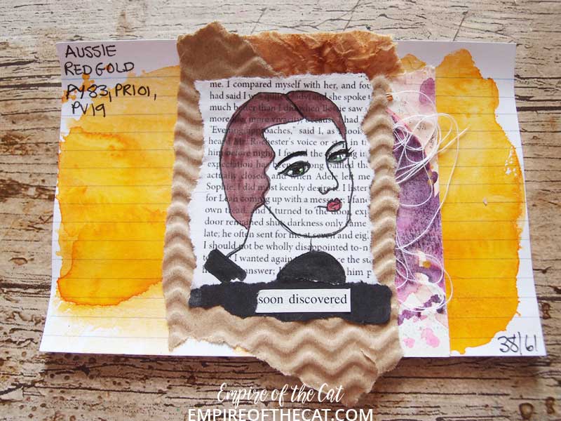
Day 38 – Aussie Red Gold – PY83, PR101, PV19 – This is also a Daniel Smith colour that I first had as a sample and knew that I just had to have a tube of it. I bought it when I was creating my ATCs for the 100 day project, and this colour was perfect for my Martian ATC book cover – you will see on that project that the colour is a lot more saturated and very orange.

Day 39 – Cobalt Turquoise – PB28 – Turquoise is one of my favourite colours and you will find me using it a lot. If not turquoise then teal lol. In fact if you look back on Day 6, you will see that I used a Cobalt Teal (PG50) as one of my colours. That colour was made by QOR and to me, it is more turquoise than teal, but either way, it’s a beautiful colour.
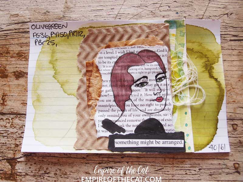
Day 40 – Olive Green – PG36, PY150, PR112, PBr25 – There is something about Olive Green that I just love! This one is another Mijello colour and it is made from four different pigments so I would probably not risk mixing it with much given how many pigments are already included (a green, a yellow, a red and a brown). But why would I need to mix it with anything, it’s perfect just as it is.
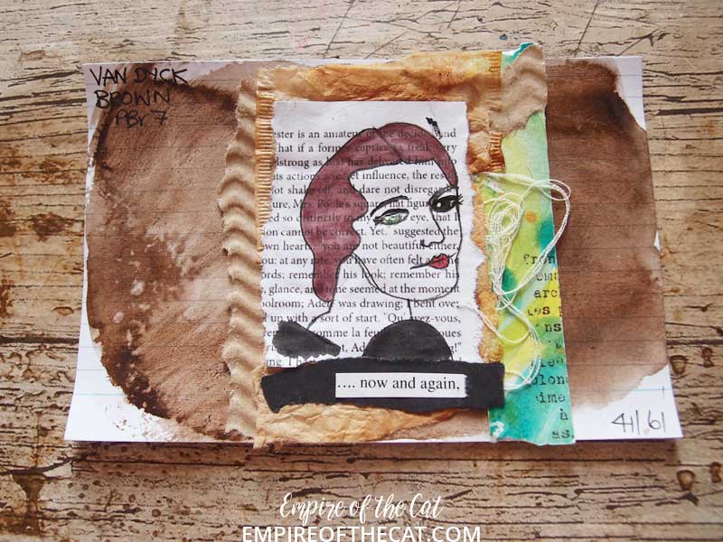
Day 41 – Van Dyke Brown – PBr7 – This is a lovely cool brown that I use a lot in whatever medium I have it,

Day 42 – Permanent Red – PR112 – Not a big fan of red but if you need a good bright clear red pigment then you can’t really go wrong with this one.

Day 43 – Red Brown – PBr25 – this single pigment colour is also known as Permanent Brown but for some reason Mijello call it Red Brown which I suppose is accurate given the red tint to it. It’s not an essential colour unless you really like it as it is very similar to a Burnt Sienna.
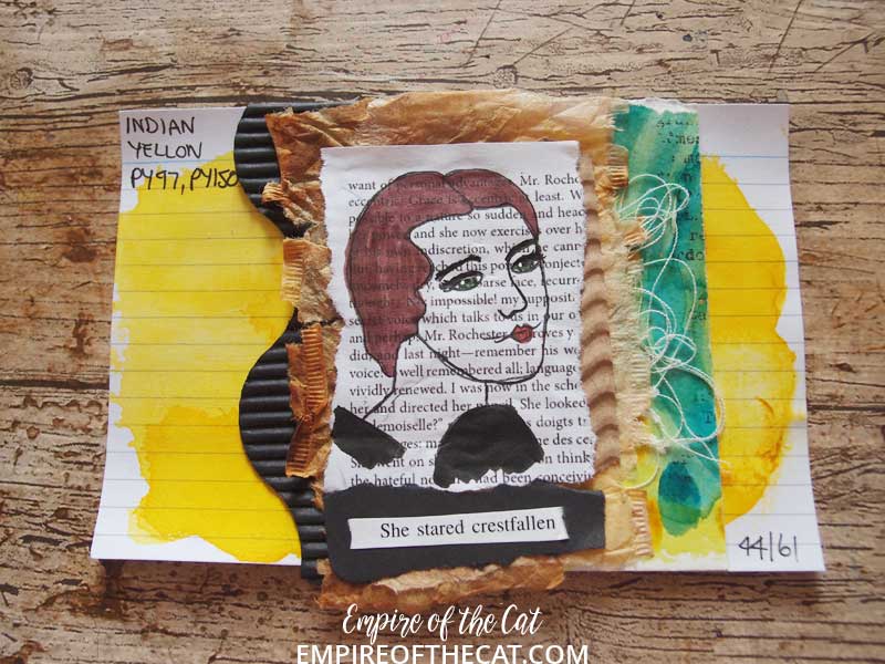
Day 44 – Indian Yellow – PY97, PY150 – This is a Daniel Smith paint but this colour is quite common in other brands. This colour is a mix of Hansa Yellow Medium (PY97) and Nickel Azo Yellow (PY150) so it can be easily mixed if you have those two colours. I just happen to have it already mixed.
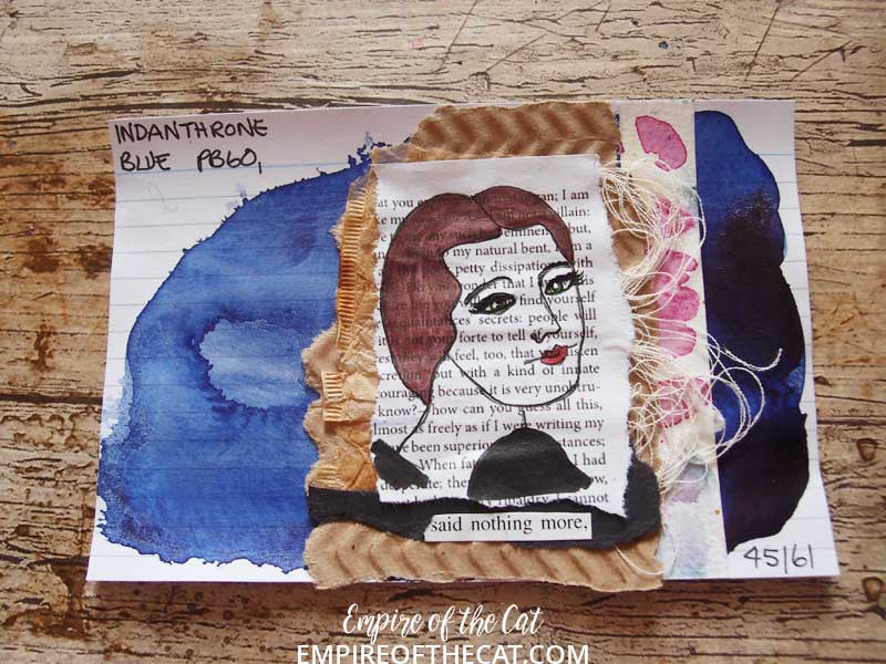
Day 45 – Indanthrone Blue – PB60 – This is a Daniel Smith paint but you can find this colour in many different brands and other names including Indanthrene Blue, Royal Blue, Dark Blue Indigo and Delft Blue.
This batch all include the Jane Eyre printouts, waffle cardboard packaging, thread, black card, teabags, and leftover watercoloured scraps and some found words that I tried to make into a little story of sorts. Unlike my last batch of very colourful ICAD girls, I kept this batch very plain, just colouring the hair, eyes, lips and a bit of clothing with Pitt pens, so that the book paper could shine.

Let me know what you think in the comments. Now on to the next batch!
As always, thanks for reading!

Ingredients
index cards, watercolour paint, collage, book paper printouts, waffle cardboard packaging, teabags, found poetry, black corrugated card scraps, leftover watercoloured scraps, black card, thread, black pen, white pen, Pitt pens, glue
Challenges
ICAD – Day 28-36
You might also like . . .


I’ve missed so much and am now trying to play catch up. I especially like the layering of these. I am drawn to the blue for some reason.