

Hi Crafty Friends!
I have another card for you today, this time it’s my entry for the More Than Words Mini Challenge for November which starts today and runs until the end of the month.

The word for this month’s challenge is GREAT, so I have been pondering how I wanted to use it on a card and this is what I came up with. First of all, I thought easy peasy, there is bound to be a stamp set that has the word “great” in it, so I spent way too much time, going through my collection and in the end I only found two that had sentiments with the word “great” in them. There was a Mama Elephant one that had a quote about great friends and great books, and there was a Pink Fresh stamp that had something about being in a great place, but they were both really quite small so although I could have used them, I really wanted something bigger that would have more impact. So I decided to use some of my alphabet dies and cut out my own sentiment. I chose this set from Pink Fresh Studios which I think from memory is called Adore or Adore You (?) I will have to check [edit: Adore Alpha!], I like it because the letters are about 1.25 inches high, so a good size, it’s a chunky, slab collegial-style serif font, that reminds me of a college hoodies, and it cuts out an outline as well as the letter itself – so that’s a bonus two for one right there. You can use them together or separately ie think of making two cards with the same sentiment – one card using the outline and the other using the inside letter. Or you can do as I did here and use them both as part of an eclipse effect, this time with the outline in a different colour – kind of a twist on the usual eclipse technique!

Unfortunately I don’t have many photos of this process as it was dark and I didn’t take any more after the one above, but I also forgot to take one of the background – which is a Distress Oxide one from my stash – and I forgot to take one after I cut out the letters from it! But anyway, I make quite a lot of eclipse cards, so there are plenty of photos here on the blog. So first of all, I needed to measure the background and work out how many letters I could fit on it. This was originally 8.5 x 6 inches, so I cut it down to 8.25 x 5.25 inches so I could fit it on a card that would be 8.5 x 5.5 inches, which is one piece of standard sized American cardstock folded in half! Yes I like big cards and I cannot lie!
So once that was done and I could see that I could fit three lines of text vertically down the card in landscape format, and that I could just have enough room for GREAT and an exclamation mark, I taped down the alpha dies and cut them out of the background, paying very special attention to all the little bits and pieces that would have to be pieced back into the spaces. I then cut the letters out two more times in watercolour cardstock as these would be used to add the dimension underneath the top letters. In the photo above, you can see that I have already started piecing the letters back into the die cut spaces, and that they are all white. The original plan was to use the outline in white and the inner in background pattern but then I thought it would look better if I matched the outline to the card base colour! The card base is Gina K Wild Lilac and I just happen to have the matching ink, so I coloured one layer of outlines with the Wild Lilac ink, which would become the top layer with the background pattern inner letter. You can see this has been done in the R in GREAT. So three layers of die cuts, each layer has an outline and a inner, and then the little fiddly pieces from the letters that have insides eg R, A, O, Y. Definitely a labour of love doing this lol. They then need to be stacked and placed back into the negative space left by the dies. I mentioned in my last post that it’s so cold that my glue has become sluggish and refused to come out of the applicator, so I had to use Glossy Accents as glue again. It’s totally fine to do this as it works great as glue, I just prefer to use it for its more usual purpose.

And that’s the finished card! Remember I could have used the patterned outline if I wanted it to totally disappear into the background but I liked the effect this gives with the purple outline. You can still see the pattern matches up as part of the background and with the three layers it has dimension but not too much so it would get damaged in the mail. Oh and I should mention for those that don’t know, that “eclipse effect technique” is an inlaid die cutting technique, so these letters are set into the background not glued on top of the background. If you want to see how it’s done, with step by step photos, check out this OM card I made for World Meditation Day back in May.
I am entering this card in the More Than Words November Mini Challenge which is held on their Facebook page.
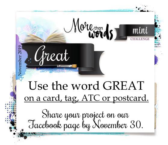
The word inspiration is:
PROJECT RECIPE:
Pink Fresh Studio – Adore Alpha die set
Gina K Wild Lilac card and ink
Finnabair – black, white, gold splatters
Glossy accents (used as glue)
From stash: distress oxide background from 2018(?), watercolour paper scraps
I love the colours you chose Elle! So pretty. What a cool die! I love the outline piece.
Love the colours on these Elle! Fabbo!