

Hi friends!
Today I am sharing my DT inspiration for the More Than Words Mini Challenge which is based on the word MISS. Yes I know the word MISS is not shown in this photo lol but this is the theme of my tag – JOMO OVER FOMO.

Fear of missing out is a social anxiety stemmed from the belief that others might be having fun while the person experiencing the anxiety is not present. It is characterized by a desire to stay continually connected with what others are doing. Wikipedia

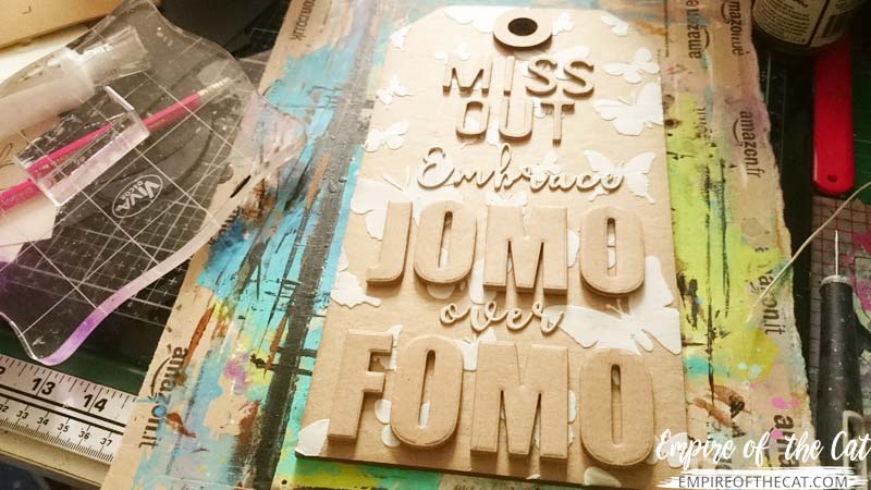
So I say, let’s all MISS OUT and embrace JOMO over FOMO. JOMO is the JOY of missing out and what a relief that can be.
Here’s a quick look at how my tag came together:
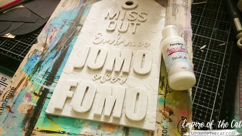
First of all, I used some old cat food boxes (Felix) to die cut some letters from a variety of alphabet dies.
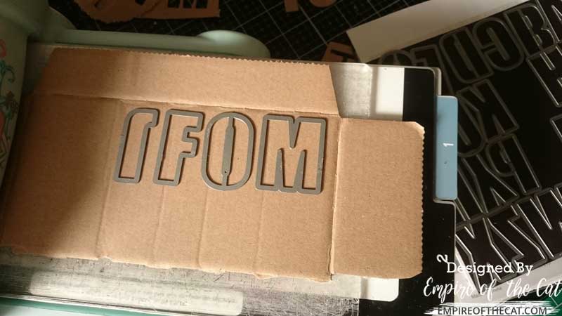
The big JOMO FOMO ones are the Altenew Bold Alpha thin dies, but they did awesomely cutting the corrugated cardboard. I wanted these letters to really stand out against my background, so I cut three lots of them and glued them on top of each other.

Next I cut the rest of the letters I needed for my tag – I used the Tim Holtz Letterboard Bigz for MISS OUT, and the Sizzix Elle upper and lower alphabets for the scripty words. All of these words I cut out twice and stacked them on top of each other for more height, before gluing everything down on my tag.
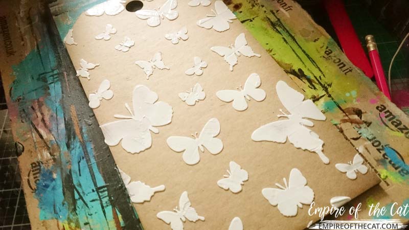
Then I painted everything using Paperartsy Snowflake paint, I skipped the gesso all together as this paint has great coverage on its own.
When it came time to paint this tag, I chose pink for my colour palette instead of my go-to colours of purple or turquoise/teal. Pink is a very happy colour that has actually been proven to make people feel better, so given the theme of this tag, I thought it was a good choice to make people feel better when they see the colour and read the words. Of course, if you hate pink, then it’s never going to make you feel better lol but perhaps deep in your subconscious you secretly are benefiting from it without your knowledge!I chose these four Paperartsy Fresco paints and used them to paint an ombre background, light to dark, over the whole tag.
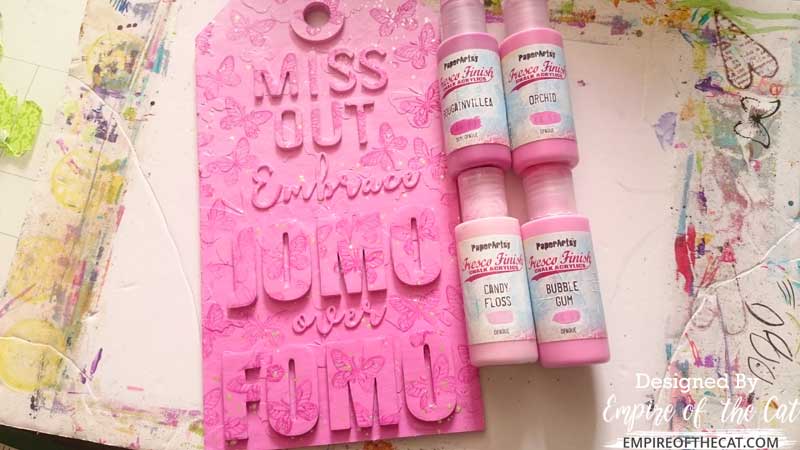
Once that was all dry, I felt like it needed something else so I used a small butterfly stamp and the Bougainvillea paint to stamp all over the background. And if that still wasn’t enough, I added some gold splashes!

I’d love to see what you make so don’t forget to enter the More Than Words Mini Challenge which is open till the end of the month!

So what do you think of my tag and most importantly, the positive statement I put on it? Are you embracing the joy of missing out? Let me know in the comments below.

Project Recipe
Tim Holtz etcetera tag (small but small is BIG)
Paperartsy chalk paints
Nuvo Deluxe Adhesive
Gold paint
Butterfly stamp
Alphabet dies
From stash: cat food box cardboard
By the way, if you feel like you are missing out by not having some of the products I have used, then use what you have. You don’t need to buy these big tags, you can cut some out of cardboard; you don’t need to use dies to cut alphabets, you can cut them by hand; you don’t need to use branded paint, you can use whatever you have in your stash.
You might also like . . .


Thanks for visiting today. Your comment is really appreciated.